Blog
Thursday November 26th 2015, 12:23 am
Thanks for so much enthusiasm for the issue 1 original art, most has found its way to friendly hands.
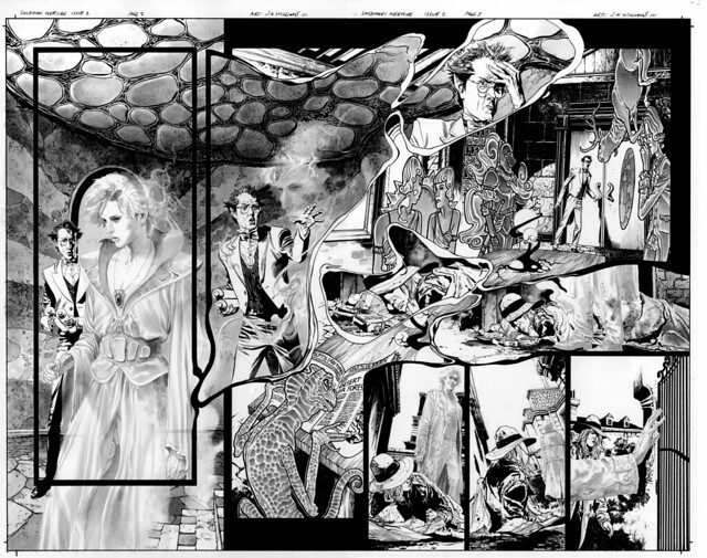
We’ve selected the next date for available Sandman Overture 2 art to be Saturday December 12th. The time of the release will be 12pm noon PST.
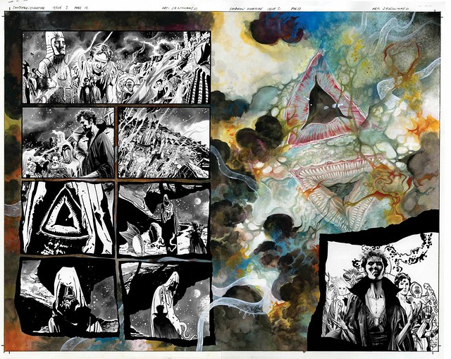
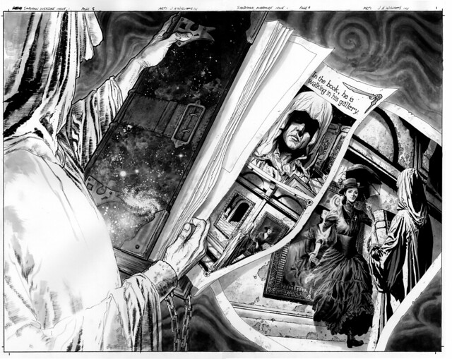
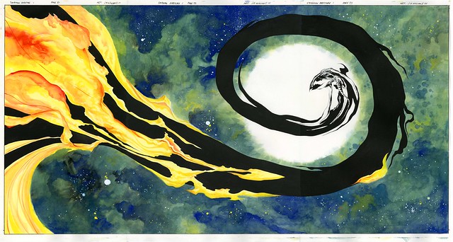
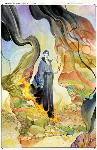
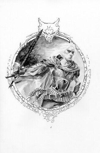
For your enticement (this one is for all the Lovecraft fans, and one of my favorites). It was mostly done using ink (brush and pen), ink wash, copic grey-tone marker, gouache, white ink, and bits of color pencil …
Tuesday November 17th 2015, 11:57 pm
I want to thank everyone for such a tremendous response to the original art of Overture 1 last Sunday. So happy that much of it has found good homes.
Now time to start revving up for Overture 2. A date and time will be coming soon. In the meanwhile, for your enticement…
Friday November 13th 2015, 3:02 pm
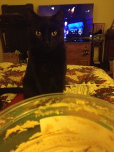
I lost a dear friend yesterday. His name was Bhangra, and he was a cat. A special cat. I know that those of us who have cats know how special they all are. But he was particularly special to me. I certainly have loved all of our cats that have been a part of our lives. But he was different. He was the one that always had to know where I was, he to had have breakfast with me everyday, If he’d been out on a backyard adventure I had to be the first thing he needed to see upon returning to indoors. He was a master hunter. Catching mice was his sport. We all distinctly remember the time he proudly walked through his cat door with two mice in his mouth at the same time, one already dead, the other not. How does a cat even do that? Master hunter indeed. He very much liked people, but wasn’t cuddly. He loved food, food was love. His favorite thing was to eat while getting a good rub down. He beckoned for food that you’d think a cat wouldn’t want anything to do with, like hummus; that is what he is doing in the above photo, demanding hummus. Always difficult because you can’t give a cat garlic. He was very much an office cat. Wanting to be in my lap while drawing, or writing. Sometimes content to just quietly sit next to my chair as I worked, often settling around my feet, or sleeping on my scanner. But it isn’t all those things that made him so special. It’s simply something that my loving wife said to me yesterday while laying in a crumpled blubbering mess, she said that he chose ME. That he had wanted me to be his best friend. This morning I stared at the bedroom doorway, as I kept hoping he’d be there patiently waiting for me to get up so we could have breakfast. But now he’s gone, he had cancer, he sadly withered. I’m left now to look at my office without him. And after a few days I’ll have to try to get on with work, even though something fundamentally is wrong now.
In 2012 I had written an experimental bog project, one that required me to post something everyday, and I had written something that was about him. That attempted to show how big of a personality he was. So I’m posting it again below in his tribute.
Jet sheen, light shines off revealing elegant ripples of sinewy strength. Leaping and jumping, no barrier can hold against. Sleek and intimidating, moving silently like a true hunter, a warrior not to be trifled with. Ruling from above, lethal, baring a mouth full of daggers. Stalking proud, always watching with gleaming eyes of yellowed flecked jade. Tall pointed ears perk, no sound escapes attention. The deepest shadows engulf, vanishing like a ghost, becoming invisible in the dark of night. I am lord of this domain and master of many, of lands vast, filled with concrete, trees and tall dried grasses. I claim this all. Be it burning hot, sleet, or rain, I will prowl, I will guard. I am King, The Mouse-Killer, Friend to giants. I am Bhangra, The Cat.
Saturday November 07th 2015, 8:08 pm
WE’VE REVISED THE TIME OF THE SALE TO NOW BE 12PM NOON PST!!
Mark your calendars, set your notices, set your clocks.
Each issue of the original art will be made available every 3 to 4 weeks. Those dates will post shortly after each sale starts.
Our store uses Paypal, so if you’re not set up for a verified account, it’s recommended to do that. They offer various ways to obtain purchases, including offering a payment plan.
And FYI, some pieces may not be made available. This means they stayed in the family. So if you don’t see something, that would be why.
For your enticement…
Friday November 06th 2015, 2:26 am
The Sandman Overture deluxe hardcover book is out now.
It features some fun extras that date back by a decade, also some minor coloring tweaks, but most importantly it features a scene from the final chapter put back to how it was originally meant to be presented. There isn’t necessarily anything added to the art of this scene, but more on how it was meant to be paced and presented, which actually does impact how the scene feels and functions, giving it broader visual scope.
For those who have read the story in singles form already, I’m sure you’ll see what I’m talking about when you read it all again in this very fine edition. But for those who are coming to this story for the first time, you won’t even realize that anything was amiss, it flows as intended without second guessing it.
So I hope you all find plenty of enjoyment in taking in the story as a whole now. So proud to have been a part of this project.

Wednesday November 04th 2015, 12:18 pm
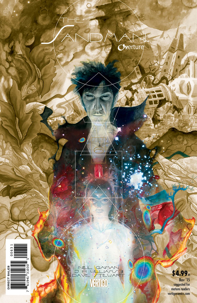
November 15th at 5pm PST
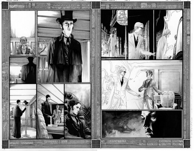
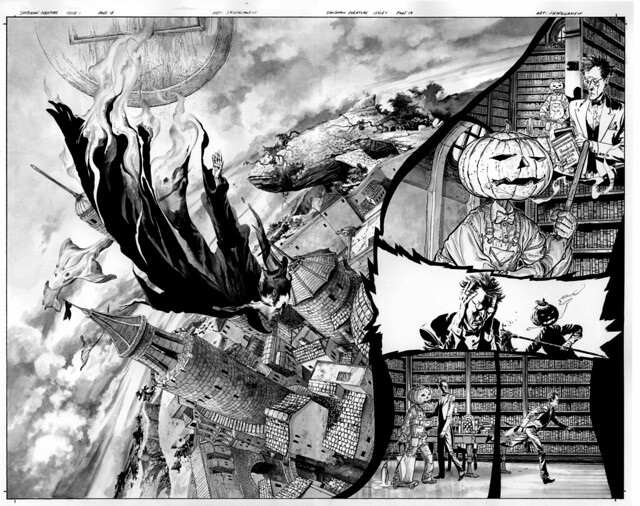
The art for Sandman Overture issue 1 goes live. Here’s a taste…
Monday November 02nd 2015, 12:21 pm
We’re celebrating the book release of Sandman Overture at one of the all time best places to do that in SF. Details are here.
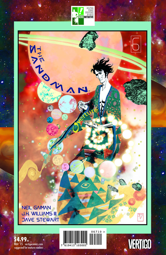
Thursday October 29th 2015, 5:17 pm
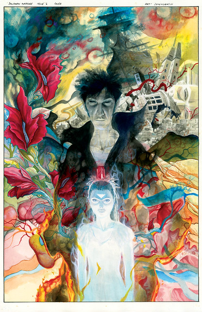
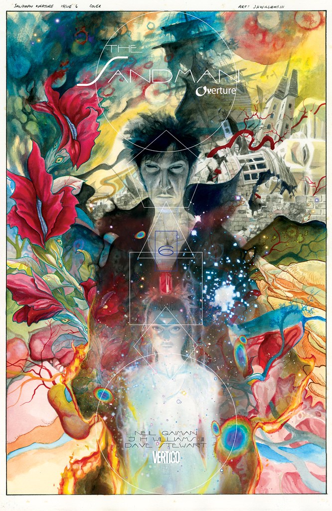
The final Sandman: Overture Special Edition is out out now, with issue 6. This is the best looking one yet, the design team did a great job at creating such a cohesive look. And we’ve put a few fun extra things in there for your amusement. Below is the raw cover art featured for this final Special Edition. Hope you enjoy it…
Wednesday October 28th 2015, 12:19 pm
SANDMAN OVERTURE CELEBRATION
Saturday, November 14th, 2015 at Isotope in San Francisco
Celebrating the release of the biggest book of the decade, the SANDMAN OVERTURE DELUXE EDITION hardcover!
Illustrated by JH Williams III (SANDMAN OVERTURE, BATWOMAN, PROMETHEA, CHASE)
There are few people on planet Earth we love more than JH Williams III (if you like beautiful memories people share with their friends this will bring tears to your eyes) and together we’ve been quietly planning our event to celebrate the amazing SANDMAN OVERTURE for a long, long time. As Jim doesn’t make very many public appearances we know his visit is going to be *very* popular. The Isotope staff wants you all to have a wonderful experience meeting him and for everyone to get to create amazing memories of JH Williams III’s visit together. So we’re doing a duo of events as only the Isotope can to make sure everyone has a chance to meet one of the nicest and most talented people in all of comics! First up is a casual, daytime signing event for the under 21 crowd, and then an epic celebration later that evening for the folks who like our mix and mingle, bring-your-ID, after-dark events.
SANDMAN OVERTURE SIGNING w/ JH WILLIAMS III
2pm – 6pm, Saturday November 14th
This intimate all-ages autographing session is completely free of charge and open to all. We want to ensure you have a completely unique and personal experience with Jim so we’re specifically tailoring this event to let you have a real moment to sit down with him. Jim will sign your SANDMAN OVERTURE hardcovers, PROMETHEA omnibii, BATWOMAN paperbacks, vintage CHASE comics, BLONDIE and THE SWORD albums, and anything else he’s ever worked on. We don’t even mind if you’ve bought them elsewhere, this isn’t about us, it’s about you and Jim getting to say “hi.” As this is sure to be a popular signing and we definitely want everyone to get time to actually talk with Jim so we kindly ask that you bring no more than 5 items for him to sign. On behalf of every one of us, thanks in advance!
SANDMAN OVERTURE AFTER PARTY w/ JH WILLIAMS III
8pm – Midnight, Saturday November 14th
Full details of this event will be announced on November 1st.
A 21+ event as only the Isotope can do! If you’ve been to an after-hours party at the Isotope before you know the great atmosphere and amazing crowd that will be turning out for this. This event has a casual backstage-after-the-show vibe and gives you all an opportunity to actually hang out and get to know Jim… the way we think an in-store appearance should truly be!
Attendees of this event get a free, Isotope exclusive, ultra-limited edition JH Williams III fine art print on acid-free/pH neutral 100% cotton rag Fabriano Watercolor Paper, lovingly printed using Epson’s archival UltraChrome inks with a lightfastness rating of over 200 years. Created specifically for this event by Williams and the Isotope, and available nowhere else on the planet, this hand-numbered print is suitable for framing… and… something even cooler!
We can’t wait to show you more!
Full details on SANDMAN OVERTURE AFTER PARTY w/ JH WILLIAMS III will be announced on November 1st.
Come join us for our biggest, our best, and our most beloved event of the entire year.
Friday October 16th 2015, 1:35 pm
NOVEMBER 15th! Mark your calendars, set your notices.
Issue 1 art is where we’ll start. And we’ll make another announcement with the time of day the sale will begin.
Each issue of the original art will be made available every 3 to 4 weeks. If the art for the issues goes to new homes quickly there is thought to maybe speed up the time table. But the main reason to have some short pauses between each issue being posted is to give people plenty of time to save their pennies.
After looking around at several options on how we were going to sell the art, it looks like the best way to do that is keep it right here in our webstore.
Our store uses Paypal, so it’s recommended to set that up. They offer various ways to obtain purchases, including options to have a payment plan, but I believe you have to have your membership account verified.
For your enticement…
Tuesday September 29th 2015, 12:22 pm
Finally out this week is our final chapter to the Sandman Overture. It’s been a long journey, one that surely took much longer than anyone expected, a cosmic story across space and time, and that is certainly what it felt like creating the series. But in some ways highly appropriate that it occurred this way, that life kept interrupting our journey, stalls and starts, ebbs and flows, moments of pause to wonder, then bursts and rushes of energy. The story itself has this quality to it, and so our lives and bumpy work flow schedules parallel. I think there is no coincidence that Dream’s life is jerked and interrupted by a massive bump in the road, as he is forced to deal with a problem that orbits him, one that threatens universal stability, and that we also seemed to experience our own set of interruptions as the unexpected in life pulled and tugged us away from working on the project in a fluid manner. Perhaps this very nature is why the story itself seems to evoke this sensation. Art affecting life, life affecting art.
Below are variations of the cover to the final chapter.
So once you’ve absorbed the last issue, you’ll get to do it all over again when the Special Edition hits– there are a few fun surprises in store for the final installment of that.
And lastly, there is a very special Hero Initiative cover for this final chapter, proceeds going to a very good cause. You can see it and other cover variants below…
Regular cover…
Gold variant…
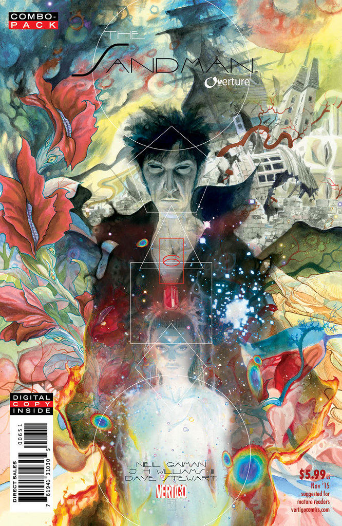
Combo pack variant…
Hero Initiative variant cover…
Here is where you can find more information and where to get ahold of the Hero Initiative Cover…
Effective Wednesday September 30th, it will be available on Hero’s eBay store.
People can preorder TODAY at Graham Crackers
Info via Facebook
and:
Hero Initiative Facebook
Signed copies of the Hero Initiative Sandman Overture cover can be found at…
Alternate Reality Comics, Las Vegas, NV
Flying Colors Comics, Concord, CA
The Comic Bug, two Los Angeles locations
Bedrock City Comics, five Houston locations
Wednesday September 23rd 2015, 9:55 pm
It’s taken us a long time to get to this point. Usually we would offer the original art after each issue, but with Overture being on such a strange schedule we decided it best to wait until the series was complete. The plan will be to offer one issue at a time. We are considering a week apart for each issue as well. And hopefully we’ll be able to do that in October, or when the release of Hardcover edition arrives early November. These details of where, when, and how will be posted in the next couple of weeks. But we thought it wise to start talking about it now, so those of you want a piece can start saving your pennies.
Wednesday May 27th 2015, 11:57 am
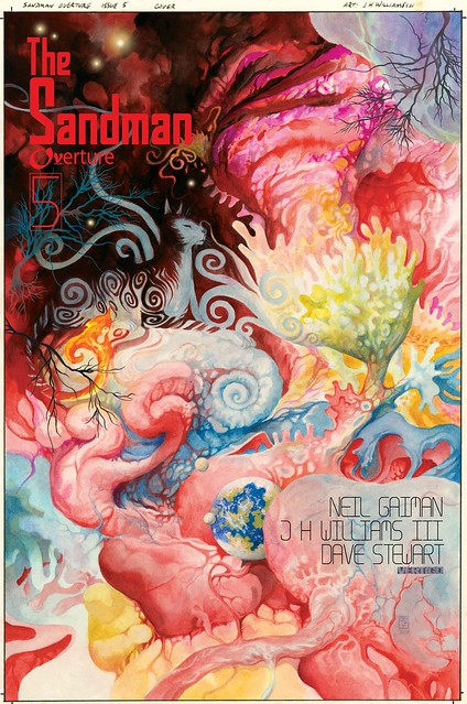
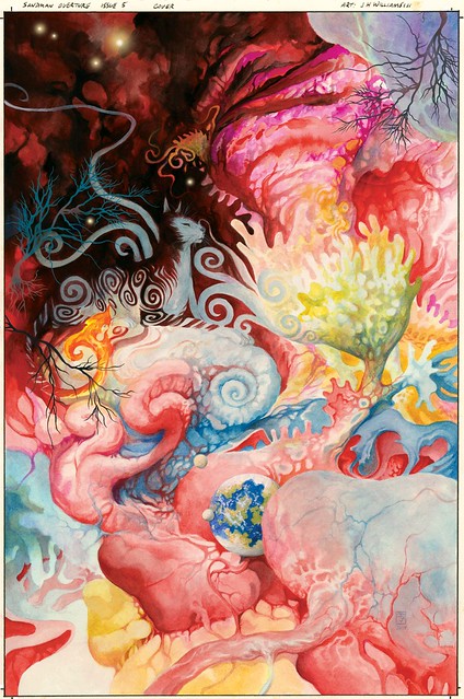
Sandman Overture 5 is finally here. Each chapter of this feels like it gets more difficult to do than the previous. And sometimes that is isn’t from how much to be drawn, but rather than what not to draw. This chapter explores that a little in places. weaving in and out from open negatives spaces to mind-bending strangeness. Sandman, as always, is a challenge. Here is the cover with and without text…
Saturday April 04th 2015, 1:42 pm
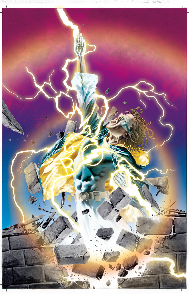
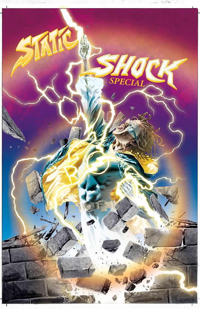
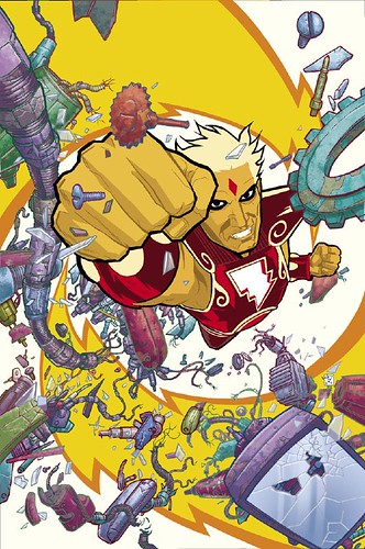
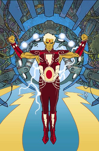
Last post was about some of my work for Milestone (the old DC imprint version of them). There I mentioned doing a Static Shock piece, arguably Milestone’s most famous creation. So I’m posting that this time as a follow up. This was done for a special centered on the character, and surprisingly I was asked to do the cover. I didn’t expect that because I’ve never been associated with the character in the past– but some other really great artists were. Those guys set up such a distinct feel for the character that I wasn’t sure I could get away from that, do my own thing, because the visual style they created for him was so strong. But I felt I really needed to push it another direction if I was going to do it. I didn’t see the point of me doing it unless I could bring something different to the mix. Most of the past interpretations of Static have been very graphic minded, thick lines and chunks of blacks. So I decided to see what he would be like with a more realistic approach, but somehow retain the graphic punch of the character. I was pleasantly surprised by the results. But what helped in the effectiveness of this particular composition was the color choices being equal parts muted and bold vibrancy. I also wanted some 70s funk music visuals as color inspirations, there was a certain type of vividness in some of the more wild visual presentation from some of that great funk stuff. So I thought pulling a little of that into this was a cool thing. It gave it that slightly unique vibe, setting it apart from the typical superhero iconography just enough, without losing it entirely. The other aspect I want to point out is the symbolism, I thought it pertinent to show him breaking through a stone ceiling, rising up and out of it into the sky. The stone ceiling representing the impenetrable hardness that many black characters come up against when trying to find an uplifted place in entertainment media, especially comics. Static Shock is one of the few that seems to have broken the cycle, making his way to other forms of media and attention, and more of that to come apparently, good for him. But he isn’t enough, there really needs to be more. It’s a bit ridiculous that there still is not more black or other ethnic heroes in the broader popular entertainment culture, considering that Marvel’s Black Panther first appeared in the mid 60’s. Below is also the logo text placement version I did for the image, having the electric energy breaking between the words. I had a really good time doing this one, I think that shows.
Thursday March 19th 2015, 1:03 pm
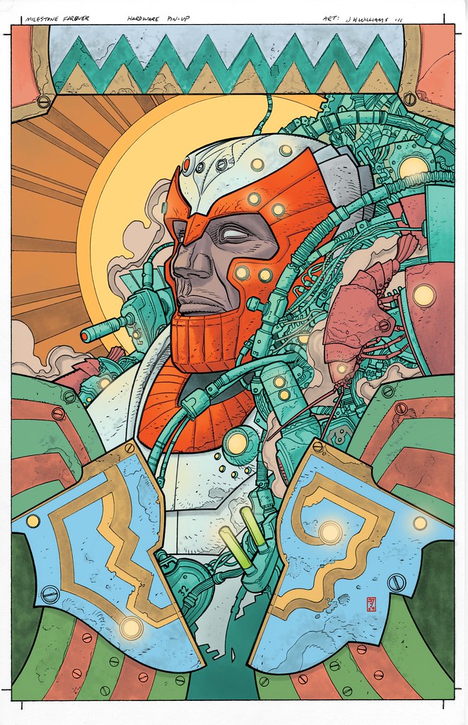
This week is another lesser known piece. Very early in my career I wasn’t getting work, couldn’t get anyone to pay attention to my stuff. Not until meeting Howard Chaykin, who in a single hour at a con became my advocate at the DC booth. He got eyes on my samples, forever changing my life. And from that came business cards, and from that came probably at least 80 pestering phone messages left by me to offices in NY until one day somebody decided to call me back. That somebody was Milestone, the forward progressive thinking venture that was supported by DC Comics at the time. Looking back at the quality of my work back then, I probably should NOT have been given a job, but I was. So I did my best to make it as good as I could. It was fill-in work on Blood Syndicate, a very interesting and diverse group. That lead to Deathwish for Milestone, another progressive forward thinking mini-series that partially dealt with lead character transgender issues within the frame work of crime fiction, interesting thoughtful material. Again, I did the best I could, I was improving. I loved Milestone, some really great comics came out of there, and was proud to briefly be there. I wish it had continued, it deserved to be an ongoing success, doing comics with fully fledged diverse characters works, this should be a no-brainer. It’s a bit disheartening to think that there still isn’t full on equal diversity within mainstream comics. It’s certainly better than it has been in the past, but there isn’t anything currently on the shelves as full with it as Milestone was. So I suppose that because where and how my career over time has moved, the types of stories I’ve engaged throughout, that even though my skills weren’t really up to snuff I did start where I should have. A type of thinking I believed in, that continues to this day. So the piece I’ve selected is from much later but relates in that it is from a Milestone special published many years later, now that my skills were really better. This time I was given the opportunity to pick the character, I chose Hardware, one of Milestones more famous concepts. Later I also did a Static Shock piece, Milestone’s most well known character, I’ll post that another time. With Hardware, I thought there was something about the tech-armor character interesting to the eye. I decided to go with the man in the machine aspect. But wanted to find this strange hybrid of influences coming together– a vaguely Kirby meets Moebius meets African folk-art thing– something that wasn’t the typical action pin-up or glory shot. I kept the colors bold and direct, which I think helped push some of what I was after. One of my favorite bits in the piece are the indications of little mechanical crustaceans. I have this obsession with placing references to sea life in my work where I can get it in. The image is a decent file, but if I come across a higher res version in my archives I’ll switch it out, but at least for now you can see the design intentions clearly.
Tuesday March 10th 2015, 12:29 pm
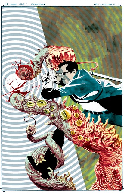
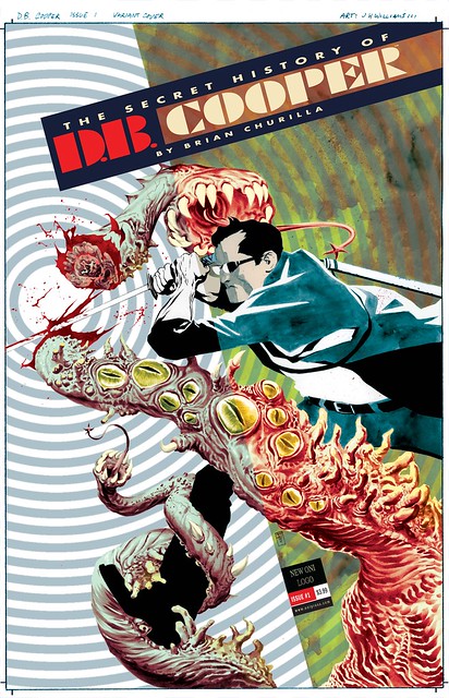
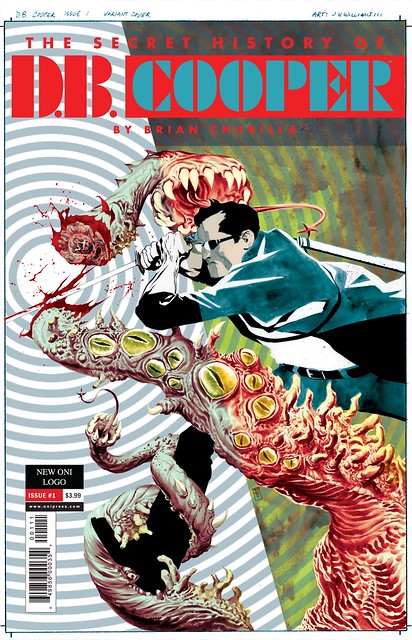
Today I’ve selected another piece not seen much. The very talented Brian Churilla created a uniquely cool series called The Secret History Of D.B. Cooper, published by the good people of Oni Press. It has this wonderful mix of strange mystery and surrealism that I really could get into. They asked me to do a variant cover for the series. Brian was going for a sort of pop art very graphic nature to the covers for this, so I wanted to do the same but without duplicating the exact feel of his images, to do my own take. The story dealt with alternate realities with touches of noir. I decided it would be interesting to really play that up for the composition, showing Cooper crossing realities through use of a very simple split composition that acts as a device of seeing the character in two realities, but more symbolically and through use of action movement, having the art change in style and techniques depending on which dimension side you’re viewing while also remaining one single image. By use of textures and style changes, keeping the backgrounds very simplistic allows for all of the focus to remain on the action. And as that action crosses into another dimension it was key in having that transition line be very simple, almost subtle but not quite, to not interfere with the action immediacy. The really fun part about this idea was showing this hint of a Lovecratian creature crossing through the dimensions, and having its colors shift depending which dimensional side you look at, and then do the same idea to D.B. as he is on the attack. I’m displaying the piece below without text, and then two versions of the logo treatment. The first logo treatment was attempting to play on the dimensional dividing line in the art, applying that to how the logo and text fit compositionally with the image. A decent enough idea, but it was decided that it just wasn’t popping enough, so the second version is what we went with, it pops with a little more color. As fun as it was to do this piece, it was so much more fun getting to read the book, which everyone should do.
Tuesday March 03rd 2015, 3:02 pm
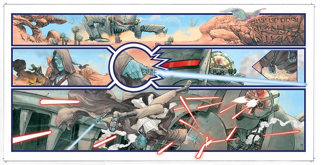
The piece I’ve selected this week was something I never thought I’d ever do: Star Wars! A few years ago I was contacted by the Lucas people saying that they were going to produce an Art Of Star Wars Comics art-book, and they were interested in me contributing something for it. I was quick to point out that I’ve ever been involved in doing Star Wars comics except for 3 covers I had done for a mini a long time ago. I wasn’t known as a Star Wars artist. In reply, that didn’t matter, that they were selecting from a small group of people to commission new pieces. I asked if I could create my own character, something new, since it was going to be a new piece. Yes! I wanted to do that because I had an idea for a piece that was to feel like a snippet of a Star Wars story we hadn’t seen. And I also wanted it to be be a very subtle homage to Jack Kirby giant monsters. But instead of it being a creature, it’s a giant war machine that looks like a creature, piloted by empire troopers. The idea was that it was facing off, like a western showdown, with one lone jedi on some alien desert world. The jedi being the lone hero in the face an evil invading force. I also wanted this to not feel like my typical work in terms of techniques. I wanted it to feel like something closer to classic fantasy illustration. The result is a wide fold out image of sequential art, not a splash poster type of thing. I used the width of it to loosely convey in design for the middle tier of panels the vague shape of a lightsaber, as the actual lightsaber in the story flickers to life. The entire image was rendered in black and white greytones, ink, and ink wash, then scanned into photoshop and digitally painted it. Normally for something I paint I do that work physically on the board. But with this I wanted to make absolute certain I had completely control over the clarity of the colors, so I went with digital paint. This also was helpful in keeping the design work very clean. The odd thing was that the hardest part of the entire image was getting the lightsaber and laser fire to look correct, graphically solid but still feel like energy bolts and blade, to feel like Star Wars. It was surprisingly difficult to get that effect cleanly. Looking back on it, I wish I had the lightsaber flickering to life in those middle panels with the blade running completely off on the right side of the page, literally coming out of the images entirely. Ultimately though, I think the sequence is relatively successful in capturing the feel of Star Wars, slightly filtered through my own sensibilities.
Wednesday February 25th 2015, 10:46 pm
Out today is Sandman Overture 4 special edition. I ended up doing a decent length interview for this, talking about process with editor Sara Miller, hope it’s amusing. And we used some photos in spots that show my mess of a workspace. Yay.
Monday February 23rd 2015, 8:11 pm
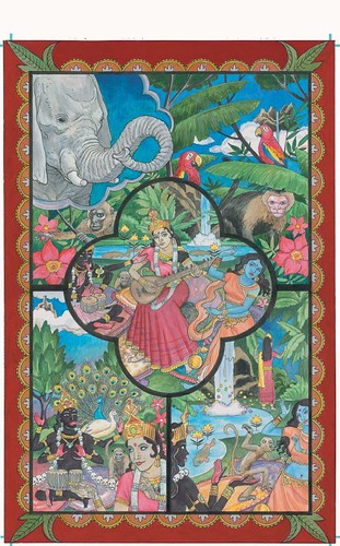
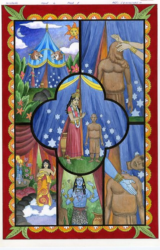
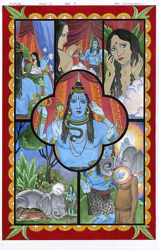
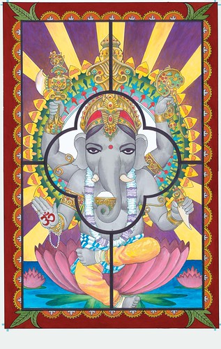
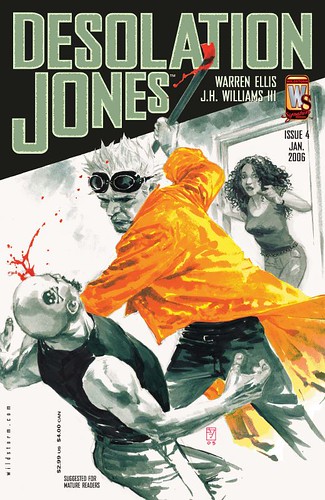
This time I’ve selected a set of pages that was from a not as well known project. Back when we still actually had Wildstorm, before it got fully absorbed into the DCU, they published many different types of really good creator owned books. Much like what has become much more popular in the market today. One of the them I was involved in, besides Promethea and Desolation Jones was a little labor of love called Wild Girl, written by the very talented Leah Moore and John Reppion, and drawn by the incomparable Shawn McManus with a little help from myself. Each issue featured a short sequence aspect that was a story inside the main story. Leah and John asked for me to do these special segments. I suspect that had something to do with seeing that I could tackle various styles and they really wanted each of these brief story segments to be unique from each other and from the main look of the book that Shawn was handling. I loved the concept of this series, and liked the idea of being able to do something radically different each chapter. Playing around with different styles and techniques is something I really can’t help myself from doing, so any opportunity to make that work in the context of the greater narrative is something I relish. The pages below are my complete sequence from the final chapter of the series, and one of my favorites to do. It pushed expectations in ways that excited me. A story about about gods of India, so I wanted to give it all a sort of eastern hand-painted folk-art look, but also had to keep it feeling like comics. An interesting challenge. The result is something unique, and not what one typically thinks of when thinking comics. I keep asking for this series to get collected into tpb, so people can discover it again. It was interesting material and a pleasure to work on.
Monday February 16th 2015, 11:59 pm
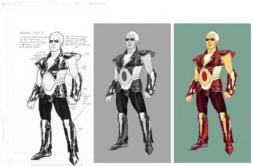
Sticking with the theme of cosmic from last week– here is that relatively unpublished Warlock cover I mentioned. It was meant to be for issue 6, but with that particular series being canceled at issue 4 or 5 it never saw a full a release. I think it may have been used in the tpb of the story, can’t remember for certain. The fun thing for me about this is the pose I chose. Not many know this, but I love Ultraman. One of the all-time greatest Japanese live action monster versus space-alien hero shows. I remember fondly being eager to get home from school when I was a kid to catch the latest 30 minutes (with commercials) campy bliss of it all. It was that show and along the Adam West Batman TV episodes, and numerous anime shows from then that sparked my fertile young mind. At the time there wasn’t really anything like Ultraman being shown regularly, other than Godzilla flicks (love those too). Back then I had no idea that what I was watching was from the 1960s. There was so much crazy mind buzzing things going with that Japanese stuff. I couldn’t help but fall in love with it. To this day I get giddy over the concepts and characters, I still really dig this cheesy campy stuff. But at this point you’re probably asking what the hell does this have to do the Warlock cover below… You see, there was an often used iconic shot whenever SSSP senior member Hayata used this device that turned him into the enigmatic silver and red giant alien Ultraman. It’s one of those things that just doesn’t go away from my brain, forced tight perspective angles, permanently imprinted glory. So, for this Warlock cover I decided to try to capture that same effect. It came out somewhat alright. When I look at it, I want to imagine the sound effects and cheesy heroic music as its companion. I’m not certain at all why I ended up associating doing a Warlock cover with my fascination of Ultraman. Perhaps it’s the graphic design nature of both characters, some subliminal correlation taking place, I don’t know. Or… perhaps it’s just simply they’re both cool as hell.
Monday February 09th 2015, 8:54 pm
Quite some time ago I was given the opportunity to redesign Warlock for Marvel. This was way back before all of the film stuff for them went into play. The formidable Greg Pak was tasked to write a new series, and for some reason the people in charge felt I could contribute something to the new design, and also do the covers for the series. Charlie Adlard was the interior artist, and as always did a great job. Unfortunately the thing just didn’t take off, and so it was abruptly cancelled at issue 4, resulting in an unpublished cover (I’ll post that later). I’ve always loved Warlock, one of my all time favorite Marvel stories, the stuff by Jim Starlin was/is a tremendous inspiration. So being asked to be involved in an attempt to bring the character back, I was excited over the prospects. The trick for me was to try do something visually new with the character while very much adhering to what made him visually strong in the first place, staying true to the right feel, to do my best not to defile Starlin’s golden child. It was daunting, but the result is pretty interesting. It’s too bad this wasn’t coming out now. I think it would’ve been a hit now. With the new interest in cosmic Marvel happening, and excitement over what future films may bring in this area, I thought it would be cool to post these two images. The first is my final design, color by me. The next is the first issue cover for that series, color by my pal Dave Stewart
Wednesday February 04th 2015, 10:33 pm
Well, in an attempt to keep things relatively active here (I’ve been very neglectful)– I’m thinking about occasionally posting random images from my gallery at Flicker. Post a comment if you think this is a decent idea, or just a bit dull. Usually, in the past, I’d have more frequent content. Such as art of what I’m working on. But with Sandman, every reveal before issue releases is understandably negotiated by editorial. It’s difficult to figure out what can be safely shown that doesn’t spoil anything. And I’m rather indecisive as to what cropped art would be worth posting. So I’ve left it alone. But the result means that the blog has been very stagnant in terms of new content. And I’ve had very little time to devote to prose writing as I had previously discussed publishing here. Extra work time has been focused on developing projects that will follow Sandman down the road.
Anyway, so I thought maybe it might be a decent idea to post older images here once a week or so. So yeah, comment if this is appealing, or not. In the meantime here is something older to look at…
Monday December 29th 2014, 10:23 pm
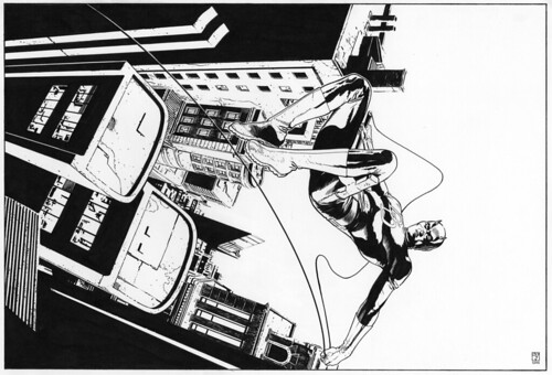
Here is some recent drawings I did for some friends of mine. You can view larger versions at Flicker…
Ghost Rider
Daredevil
Elric
Tuesday December 23rd 2014, 9:51 pm
Sunday December 14th 2014, 11:01 pm
We’re finally getting this out there. Yeah, we know it’s been awhile ;^) We do hope you enjoy it…
Here is the main cover– virgin version
Now the main cover– with logo and text
Here is my variant cover– virgin version
Now here it again– but with logo and text
And finally the digital combo variant
